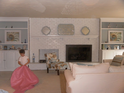
Here are some before and afters of the family room makeover. There is still lots to do in here
but at least this is a start. I started with this mood board generously posted on Young House Love.
The walls were yellow and the painted brick and built ins were an off white. They looked dirty to me.
Here's another angle.
And the view from the kitchen below. I had an old school TV. It was so darn heavy and huge. I was so glad to have it taken away. My hub wanted to put it somewhere else but I had the TV guys haul it out of there! It was great to have it out of the house especially when the replacement is so much sleeker.
Okay, so again, this is the before:
And the after:
And a much whiter and brighter after:
And some more afters. Please don't mind the little woopie cushion.
I still have to put something above the TV. I'm thinking of a white shelf and a couple of white vases or picture frames.
I still have lots to do in here. That multi colored lamp is gone and I have a blank wall to deal with. I sold the brown couches on craigslist.
This is what I basically did:
1. I painted the brick and built ins a crisper white.
2. Changed the hardware on the cabinet doors
3. Painted the ceiling white, the walls BM Ashen Tan and the backs of the book cases BM Beach Glass
4. New white slip covered sectional, new ottoman and new jute rug on top of the wall to wall
5. Painted the cabinets in the bar area and installed hardware to match the built ins
6. The sleek TV and stand.
There's still work to do in here, like lamps, what to put above the TV, and I'm not completely in love with the mirrors on the mantel. Should I put two of these on the mantel instead? Or should I plant them above the TV? Suggestions are always welcome!
Thanks for looking!


WOW!!!!!!!!!!!!!!!!!!!!! This is fantastic! What a difference...it looks so airy and up to date!!! I agree...something white above the tv would connect things. I like the mantel the way it is! Please give detials on the sofa and rug....LOVE THEM!!!!!!!!!! :) Great job!
ReplyDeleteThanks Tracy! I almost went with the Ikea Ektorp sofa based on price, but there is no Ikea near me so I couldn't take a look at it. I ended up getting the sectional from Pottery Barn. It was on sale....still not cheap, but I'm very happy with it. The rug is from Overstock and it's the same exact one YHL used on their mood board. The pillows are from Overstock and PB. The slipper chair is from Target.com. Thank you for your comment!
ReplyDeleteActually, one of my favorite things is the quatrefoil mirror on the mantle..was going to ask where you got it! Really like the color combo of beige, white and brown. The bar looks really good painted white. Way to go!
ReplyDeleteCourtana,
ReplyDeleteThe quatrefoil mirrors are from Target. They were a nice bronze color but I painted it to match the back of the bookcases.
Thanks so much for checking in!
Tania
love the blue paint - so beachy and serene. all looks great! fabulous job!
ReplyDeleteI do love that peaceful blue color. Thanks Arpi!
ReplyDeleteThe mirrors look great! I love the new color scheme too.
ReplyDelete